Wednesday, May 4, 2011

Sunday, April 24, 2011

Friday, April 8, 2011

bounce flash


straight on no tilt


straight on 45 degree tilt


straight on 90 degree tilt


bounced back/left 45 degree tilt

Saturday, April 2, 2011

fill flash

what can i say.  sports illustrated's swimsuit issues were the first thing that came to mind.


terry richardson hanging out with some models


roy, am i right to think this is fill flash?  in these images the sun is the key and flash is used to reduce/eliminate shadow.  right?

catch lights

laurent auxietre

richard avedon

i prefer more natural looking catch lights to ones that have been created purposely for an over the top effect.  i think the most effective catch lights are ones that we usually see.  these are the ones that we can relate to, and in portraiture i feel like this relating is so important.  the above images have catch lights that are dramatic and effective, but still natural.  the catch lights in the first image are probably just the bright sky reflected in the man's eyes, and in the second they are two small points of light, mimicking the sun.  i like these because they are not the focal point.  they bring life to the facial expressions, whereas i find more engineered catch lights distract.

Tuesday, March 22, 2011

Tuesday, March 8, 2011

Wednesday, February 23, 2011

Tuesday, February 15, 2011

glass


on white


on black


for fun!


for fun!

Tuesday, February 8, 2011

glass research


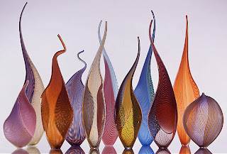
here we see some fancy glass work lined up in two rows to create an overlapping effect.  the nice thing about the overlapping is that it makes the patterns on each glass piece even more visually interesting since one seems to warp the other.  the overlapping also allows the twisty bits at the top of each piece to work together and create interesting designs.  the glass pieces are placed on plexiglass so that we see their reflection.  it seems to me that the glass is lit with the light bouncing off the seamless white background like in our glass on white set-up.  the reason i think so is that the front part of the glasswork is quite dark in the first row (indicating no frontal light).  in the back row, the glass is brighter as light seems to be coming through the bottles from behind.  the white background looks grey, so maybe some overexposure would have helped brighten things up.  even if this technique might have caused some of the glass detail to be lost, i think i would prefer the shot be brighter.

Tuesday, January 25, 2011