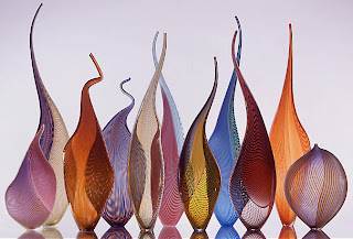
here we see some fancy glass work lined up in two rows to create an overlapping effect. the nice thing about the overlapping is that it makes the patterns on each glass piece even more visually interesting since one seems to warp the other. the overlapping also allows the twisty bits at the top of each piece to work together and create interesting designs. the glass pieces are placed on plexiglass so that we see their reflection. it seems to me that the glass is lit with the light bouncing off the seamless white background like in our glass on white set-up. the reason i think so is that the front part of the glasswork is quite dark in the first row (indicating no frontal light). in the back row, the glass is brighter as light seems to be coming through the bottles from behind. the white background looks grey, so maybe some overexposure would have helped brighten things up. even if this technique might have caused some of the glass detail to be lost, i think i would prefer the shot be brighter.

No comments:
Post a Comment